Responsive Web Design Benefits for Business Websites
Learn how responsive web design improves mobile usability, navigation and enquiry journeys. Includes a practical device-testing checklist for business websites.
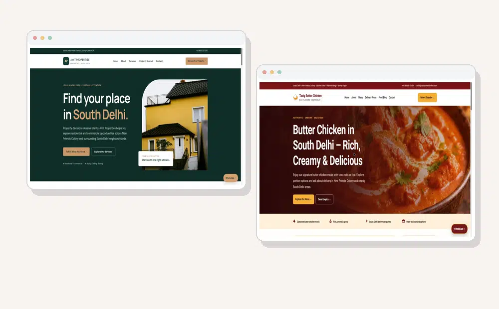
Responsive design is not simply shrinking a desktop page. Plan flexible content widths, readable text, touch-friendly navigation and forms that remain usable on narrow screens.
How to audit responsive layouts: test the homepage, main service page, pricing section and contact form at narrow, medium and wide widths. Look for clipped text, horizontal scrolling, hidden buttons and oversized images.
For service businesses, keep the primary enquiry action visible without obscuring content. Make telephone links tappable, label form fields clearly and confirm that validation errors can be understood on a phone.
Use responsive images with appropriate dimensions and compression so mobile visitors do not download unnecessarily large desktop assets. Check real-device behaviour as well as browser emulators.
A responsive website is a usability foundation, not a guarantee of rankings. Evaluate page relevance, accessibility, performance and whether visitors can complete important tasks. For more detail on this related topic, see How SEO and Web Design Work Together.
Before approving a redesign, ask your provider to demonstrate the menu, quote form, image galleries and checkout or booking flow on common mobile and desktop screen sizes.
In this article, we'll explore why responsive web design is essential and how it benefits your business. Responsive web design is an approach to website development where the layout and content automatically adapt to different screen sizes and resolutions.
Instead of creating separate desktop and mobile websites, a responsive website uses flexible grids, images, and CSS to deliver a consistent experience across all devices.
Visitors expect websites to be easy to use, regardless of the device they're using. A positive user experience encourages visitors to stay longer and explore more pages. With a significant portion of web traffic coming from smartphones, mobile optimization is critical. This leads to happier users and higher engagement.
Google uses mobile-first indexing, meaning it primarily evaluates the mobile version of your website when determining search rankings. For more detail on this related topic, see Benefits of Hiring a Professional Web Design Company.
Responsive web design supports SEO by. Use descriptive page titles, a logical heading hierarchy and crawlable links to important pages. These are useful foundations, although visibility also depends on content quality, competition and ongoing work.
A responsive website is more likely to perform well in search results. Managing one responsive website is easier than maintaining separate desktop and mobile versions. This saves both time and resources. A website that works smoothly on every device makes it easier for visitors to take action.
A responsive website removes barriers and increases conversions. Responsive websites are typically optimized for performance. Techniques such as image optimization, lazy loading, and efficient coding help pages load quickly on both desktop and mobile devices. Fast-loading websites improve user satisfaction and SEO.
Visitors often judge a business based on its website. A professional, responsive website communicates that your business is modern, reliable, and customer-focused. Poor mobile experiences can damage credibility and cause potential customers to leave.
Building one responsive website is more affordable than developing and maintaining separate websites for different devices. It's a long-term investment that delivers ongoing value. New devices with different screen sizes are constantly being introduced.
Responsive web design ensures your website remains compatible with current and future devices without requiring major redesigns. This helps protect your investment. Many businesses still have outdated websites that perform poorly on mobile devices. Providing a seamless experience can give your business an edge.
Your website may need a redesign if. Review menus, tap targets, form fields and the primary call to action on real phones. A layout that merely shrinks to fit a narrow screen is not necessarily comfortable to use.
Text is too small to read on mobile. Pages load slowly on smartphones. Navigation is confusing on smaller devices. Bounce rates are high for mobile visitors. If you notice these issues, it's time to upgrade to a responsive design.
Responsive web design is no longer optional for businesses that want to succeed online. It improves user experience, boosts SEO, increases conversions, and ensures your website looks professional on every device.
Whether you're launching a new website or redesigning an existing one, investing in responsive web design is one of the smartest decisions you can make for your business.
Responsive web design is a development approach that allows a website to automatically adjust to different screen sizes and devices.
Why is responsive design important?
It improves user experience, supports SEO, increases conversions, and ensures your website works well on smartphones, tablets, and desktops.
Does responsive web design help SEO?
Yes. Google recommends responsive websites because they provide a better mobile experience and are easier to crawl and index.
Can an existing website be made responsive?
In many cases, yes. However, older websites may benefit more from a complete redesign using modern responsive design techniques.
Is responsive web design suitable for small businesses?
Absolutely. A responsive website helps small businesses reach more customers, build trust, and compete effectively online.
Build a Mobile-Friendly Website with WebDesignKart
At WebDesignKart , we create fast, responsive, and SEO-friendly websites that deliver a seamless experience across all devices. Whether you need a new website or want to upgrade your existing one, our team can help you build a site that looks great and performs even better.
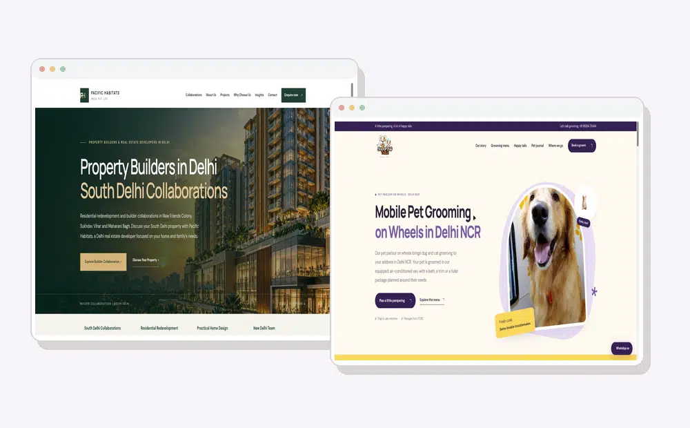
📞 Contact WebDesignKart today for a free consultation and let us create a responsive website that helps your business grow.