

Why Mobile-Friendly Websites Are Essential for Business Growth
The way people browse the internet has changed dramatically over the past decade. Today, most website visitors access websites using smartphones and tablets rather than desktop computers.
If your website is not optimized for mobile devices, you could be losing valuable customers, leads, and sales every day.
A mobile-friendly website is no longer optional—it's a necessity for businesses that want to compete and grow online.
What Is a Mobile-Friendly Website?
A mobile-friendly website automatically adjusts its layout, content, and functionality to fit different screen sizes.
Whether visitors access your website from a smartphone, tablet, laptop, or desktop computer, they should enjoy a seamless browsing experience.
Key characteristics include:
- Responsive design
- Fast loading speed
- Easy navigation
- Readable text without zooming
- Clickable buttons and menus
- Optimized images
Why Mobile Traffic Continues to Grow
Consumers now rely heavily on mobile devices for:
- Searching for local businesses
- Comparing products and services
- Reading reviews
- Shopping online
- Contacting businesses
Many industries receive more than half of their website traffic from mobile users.
Businesses that fail to provide a positive mobile experience risk losing potential customers to competitors.
Better User Experience
User experience is one of the most important factors in website success.
Visitors expect websites to load quickly and function properly on their devices.
A mobile-friendly website provides:
- Faster navigation
- Improved readability
- Easier interaction
- Better accessibility
When visitors have a positive experience, they are more likely to stay on your website and take action.
Improved Search Engine Rankings
Search engines prioritize mobile-friendly websites.
Google uses mobile-first indexing, meaning it primarily evaluates the mobile version of a website when determining rankings.
A responsive website can help improve:
- Organic traffic
- Keyword rankings
- Search visibility
- User engagement metrics
Businesses with poor mobile experiences often struggle to compete in search results.
Higher Conversion Rates
The goal of most business websites is to generate leads or sales.
Mobile-friendly websites make it easier for visitors to:
- Request quotes
- Complete forms
- Schedule appointments
- Make purchases
- Contact your business
Reducing friction in the user journey often leads to higher conversion rates.
Faster Website Performance
Speed matters.
Mobile users expect websites to load within a few seconds.
Slow websites often experience:
- Higher bounce rates
- Lower engagement
- Reduced conversions
Mobile optimization typically includes:
- Image compression
- Efficient coding
- Performance enhancements
- Better hosting infrastructure
These improvements benefit both mobile and desktop users.
Increased Customer Trust
A professional mobile experience helps establish credibility.
Visitors may question the legitimacy of a business if:
- The website appears broken on mobile devices
- Navigation is difficult
- Content is unreadable
- Pages load slowly
A modern responsive website creates a positive first impression and builds trust.
Better Local Search Performance
Many mobile searches have local intent.
Examples include:
- Web design company near me
- SEO services near me
- Restaurant near me
- Local plumber
A mobile-friendly website improves your chances of attracting customers searching for services in your area.
Competitive Advantage
Many businesses still operate outdated websites that perform poorly on mobile devices.
Investing in responsive web design can help you:
- Stand out from competitors
- Improve customer satisfaction
- Increase online visibility
- Generate more inquiries
A superior user experience often becomes a competitive advantage.
Common Mobile Website Mistakes
Businesses should avoid:
Small Text
Users should never need to zoom to read content.
Tiny Buttons
Buttons should be large enough to tap comfortably.
Slow Loading Pages
Optimize images and code for better performance.
Intrusive Pop-Ups
Large pop-ups can frustrate mobile users and impact SEO.
Poor Navigation
Menus should remain simple and easy to use on smaller screens.
Essential Features of a Mobile-Friendly Website
A modern responsive website should include:
- Responsive design
- Fast page speed
- Mobile-friendly navigation
- Click-to-call functionality
- Optimized contact forms
- Secure HTTPS connection
- SEO-friendly structure
These elements contribute to a better user experience and stronger business results.
Why Businesses Choose WebDesignKart
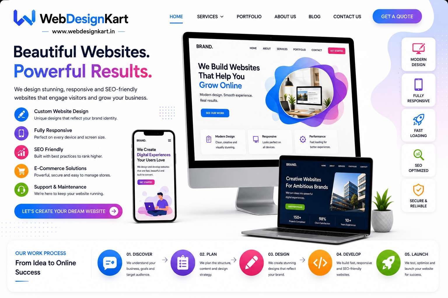
At WebDesignKart, we design responsive websites that look and perform beautifully across all devices.
Our websites are built to help businesses in the USA, UK, Canada, Australia, UAE, and India attract more visitors, generate more leads, and grow online.
Every website we create includes:
- Mobile-responsive design
- SEO-friendly development
- Fast loading performance
- Modern user experience
- Conversion-focused layouts
Conclusion
Mobile-friendly website design is one of the most important investments a business can make in 2026.
A responsive website improves user experience, increases search visibility, builds trust, and helps generate more leads and sales.
If your website is not optimized for mobile devices, now is the time to make the change and position your business for long-term growth.